Fix Media Player Indicator Extension Misaligned Controls / Text On Gnome Shell 3.28
I like having the music app controls in the Gnome Shell top bar so I can easily control whatever music application I'm using without switching constantly between windows, so I installed the popular Media Player Indicator extension for Gnome Shell on my Ubuntu 18.04 system.
But the extension widgets (the text, player controls, and so on) displayed in the Gnome Shell top bar look quite ugly and misaligned / out of place. It looks like this happens because of a change in Gnome Shell 3.28, and the extension developer has yet to fix this issue.
There's already a fix available that can easily be applied though.
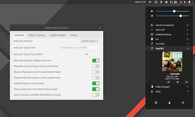
This is how Media Player Indicator looks like in Ubuntu 18.04 with Gnome Shell 3.28 without the fix I mentioned:
This is how the Media Player Indicator extension looks after applying the fix:
To fix the Media Player Indicator appearance with Gnome Shell 3.28, open Nautilus and navigate to
At the bottom of the stylesheet.css file (don't change / remove anything else), paste the following CSS fix:
Save the file, restart Gnome Shell (press
Fix credits: IBBoard.
But the extension widgets (the text, player controls, and so on) displayed in the Gnome Shell top bar look quite ugly and misaligned / out of place. It looks like this happens because of a change in Gnome Shell 3.28, and the extension developer has yet to fix this issue.
There's already a fix available that can easily be applied though.
This is how Media Player Indicator looks like in Ubuntu 18.04 with Gnome Shell 3.28 without the fix I mentioned:
This is how the Media Player Indicator extension looks after applying the fix:
To fix the Media Player Indicator appearance with Gnome Shell 3.28, open Nautilus and navigate to
~/.local/share/gnome-shell/extensions/mediaplayer@patapon.info/ (you can press Ctrl + L in Nautilus and paste this address in the address bar) and open the stylesheet.css file with a text editor.At the bottom of the stylesheet.css file (don't change / remove anything else), paste the following CSS fix:
/* fix for player controls / text not being centered in Gnome Shell 3.28+ */
.aggregate-menu .popup-sub-menu > * > * > :first-child,
.aggregate-menu .popup-sub-menu > * > * > :last-child > :first-child,
.aggregate-menu .popup-sub-menu > * > * > :last-child > :first-child > :first-child
{
    margin: 0; padding: 0;
}
/* end fix for player controls / text not being centered in Gnome Shell 3.28+ */
Save the file, restart Gnome Shell (press
Alt + F2 and type r, then press Enter, or logout and log back in) and the Media Player Indicator extension for Gnome Shell should no longer be misaligned / out of place.Fix credits: IBBoard.


